Handle Barbershop

Our Role
Art Direction
Brand Identity
Illustration
Logo and ID Systems
Typographic Design
Wayfinding and Signage

Handle is a bespoke barbershop in downtown Little Rock that was created with a deep respect for the history and craft of barbering.

Our Objective

Design the Sharpest Looking Barbershop in Little Rock

GET Global Attention along the way

Handle Barbershop, the vision of a well-traveled proprietor, was inspired by a deep appreciation for the rich history and craft of barbering, with a mission to carry that tradition forward. Nestled in a spacious, hip environment along the Main Street stretch of downtown Little Rock, the shop faced the challenge of making a modest budget meet a grand vision. To ensure the brand identity matched the unique space, outside consultation was essential.

Our Solution
Results

We crafted a brand identity steeped in tradition, drawing inspiration from 1800s-style wooden letterpress type. The mantra, "Classic Cuts and Shaves, in the Heart of Downtown Little Rock," perfectly tied together the weathered wooden floors and the bright, natural light pouring through the street-facing windows. This design approach instantly made Handle Barbershop a community hotspot, establishing it as the go-to destination for a full-service, traditional barbershop experience in downtown Little Rock.

Our efforts included logo and badge design, custom type development, and a collaborative community effort. Notably, Redgie Adams contributed his craftsmanship to the exterior blade projection signage, restored parlor pole, and window decal treatments, which showcased the additional design assets we developed. Handle's aesthetic was driven by a commitment to high-end, custom craftsmanship, evident in every aspect of the patron's experience—from the inviting space to the exceptional service.

The result was a timeless brand identity that captured the proprietor's vision for nostalgia and excellence. This start-up identity gained international design recognition and delivered an immediate return on investment, firmly establishing Handle as an elite-level barbershop with premium pricing to match.

Backward Arrow Icon
Forward Arrow Icon
001 — Handle Barbershop Logo Lockup

The Handle Barbershop logo employs fine rules for shadow-play, crafting a barber’s parlor pole that subtly alludes to the letter "H," honoring the heritage of vintage typography.

"H" Barber Parlor Pole Vintage Typographic Glyph Primary Brand Mark for Handle Barbershop in Little Rock, Arkansas.
Nº 002 — Classic Color Palette

A minimal yet high-contrast Americana color palette defines the classic visual voice of the brand, resonating with timeless elegance.

Cohesive Branded Color Palette for Handle Barbershop in Little Rock, Arkansas.
Nº 003 — Handle Barbershop Overview

Situated in a first-floor suite, Handle barbershop is outfitted with all the premium fixtures one anticipates in a masculine establishment.

Interior Design of Handle Barbershop in Little Rock, AR
Nº 004 — Handle Barbershop Wedge Sign

Custom signage, designed to anchor the corner of the shop, featureing a prominent blade motif on its exterior.

Nº 005 — Logo & Logotype

In specific instances, the logotype is utilized instead of the full logo lockup to maintain brand clarity and simplicity.

Nº 004 — Handle Barbershop Wedge Sign

Custom signage, designed to anchor the corner of the shop, featureing a prominent blade motif on its exterior.

Nº 005 — Logo & Logotype

In specific instances, the logotype is utilized instead of the full logo lockup to maintain brand clarity and simplicity.

Custom signage design and sign install for Handle Barbershop in Little Rock, Arkansas. Sign by Adams Sign.
Handle "H" Vintage Parlor Pole Shadow logo and custom logotype for Handle Barbershop in Little Rock, Arkansas.
Nº 006 — Alain "Pachi" Ravelo

Alain "Pachi" Ravelo is a distinguished barber whose gentlemanly demeanor has become synonymous with the Handle Barbershop brand.

Nº 007 — Window Graphics

Integrating digital type with custom Victorian-inspired barbershop lettering, the window graphics blend historical and modern design.

Victorian-inspired window detail graphic design and branding with illustrated raven, for Handle Barbershop in Little Rock, Arkansas.
Nº 008 — Window Graphics in Application

Vinyl decal applications welcome patrons and engage passersby along Little Rock’s Main Street, enhancing the shop’s street presence.

Victorian-inspired window detail window design install and branding with illustrated raven, for Handle Barbershop in Little Rock, Arkansas.
Nº 009 — Handle "H" Sub-Brand Mark

Designed for additional merchandise and general collateral, this brand mark is meant to pair with parent brand marks.

Nº 010 — One The Edge Sub-Brand Mark

Situated on the edge of Sixth and Main in Little Rock, the address provided the opportunity to make a text play on the concept of a sharpened edge.

"H" Sub-Brand Mark, Two-Color for Handle Barbershop in Little Rock, Arkansas.
"H" Sub-Brand Mark Reversed, Single Color for Handle Barbershop in Little Rock, Arkansas.
Backward Arrow Icon
Forward Arrow Icon
On The Edge of Sixth and Main Sub-Brand Mark and Badge Design for Handle Barbershop in Little Rock, Arkansas.
Backward Arrow Icon
Forward Arrow Icon
Nº 011 — Handle Sans Custom Lettering

With nearly a quarter of the English alphabet represented in the logotype, we expanded the set to include remaining glyphs for use as the primary headline typeface.

Handle Sans, vintage custom lettering, and type glyphs for Handle Barbershop in Little Rock, Arkansas.
Nº 012 — Look/Feel Good (Digital)

This slogan serves as both a mantra and a promise—elegantly crafted into a sub-brand mark that encapsulates the barbershop's ethos right at the front door.

Nº 013 — Look/Feel Good (Signage)

Strategically placed at the entryway, this emblem acts as a continuous reminder of the Handle brand promise, fostering a positive customer experience.

Look and Feel Good typographic lockup with barber shears, graphic design lockup for Handle Barbershop in Little Rock, Arkansas.
Look and Feel Good typographic lockup with barber shears, graphic design lockup for Handle Barbershop in Little Rock, Arkansas—installed on front door glass.

Client........Handle Barbershop
Photography...Sage Duke

© 

.........Unbound Collective

To maintain high quality and personalized attention our clients expect, we work with a select number of businesses at a time.

Join Our Waitlist

Work with Unbound and Grow your Business

At Unbound, we dedicate ourselves to delivering unparalleled focus and expertise to each of our partners.

If you're interested in partnering with us to redefine your brand's design, direction, and strategy, we invite you to join our waitlist. By joining, you'll receive regular updates about our projects, insights into our process, and news about opportunities to work together.

Join Our Waitlist
OUR PROCESS
01
Compass
Compass Process Logo Lockup for Unbound

A FRAMEWORK FOR STRATEGIC PLANNING—ALIGNING GOALS AND METHODS FOR BUSINESS GROWTH.

More About Compass
02
curation
Curation Process Logo Lockup for Unbound

A FRAMEWORK FOR STRATEGIC PLANNING—ALIGNING GOALS AND METHODS FOR BUSINESS GROWTH.

More About Curation
03
customization
Customization Process Logo Lockup for Unbound

A FRAMEWORK FOR STRATEGIC PLANNING—ALIGNING GOALS AND METHODS FOR BUSINESS GROWTH.

More About Customization

Selected Work

001
Kvinna Studio
View More

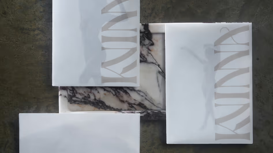
Kvinna Studio provides a bespoke photography experience, and dedicates their practice to developing distinctive printed imagery which recognizes and materializes beauty.

View Full Project
An overview of brand identity design, logo design, stationery, photography, print design, and collateral for Kvinna Studio in Little Rock, Arkansas.
Backward Arrow Icon
Forward Arrow Icon
002
The Ouachitas
View More

The Ouachitas is a coffee roaster and brewery with dual culinary and community ambitions in the Arkansas River Valley.

View Full Project
Branded Coffee Bag Packaging for The Ouachitas in Mena, Arkansas.
Beer Can Package Design and Branding for Dead to Me, Blackberry Shandy at The Ouachitas in Mena, Arkansas.
Branded Coffee Bag Sticker Label Rolls for Packaging Coffee at The Ouachitas in Mena, Arkansas
Beer Can Package Design and Branding for Madd Ox, West Coast IPA at The Ouachitas in Mena, Arkansas.
Graphic Design, restaurant illustration and Americana typography for menus at The Ouachitas in Mena, Arkansas.
Backward Arrow Icon
Forward Arrow Icon
003
MedTrust Health Alliance
View More

MedTrust is a group purchasing organization empowering senior care facilities by ensuring cost-effective procurement and transparent pricing.

View Full Project
Letterpress-printed, foil-stamped and diecut copies of the Embark Senior Living Summit VIP invites for MedTrust Health Alliance in Fayetteville, Arkansas.
MedTrust Business Card Design Back with Transparency Art Direction.
Overview of all Embark Senior Living Summit by MedTrust, attendee collateral print design, name tags, invitations, and itinerary inside of printed booklet.
MedTrust branded, die-cut sales  pocket folder package design showing semi-open view.
MedTrust art direction, iconography, and slide deck presentation in brand identity motif.
Backward Arrow Icon
Forward Arrow Icon
004
Handle Barbershop
View More

Handle is a bespoke barbershop in downtown Little Rock that was created with a deep respect for the history and craft of barbering.

View Full Project
Victorian-inspired window detail window design install and branding with illustrated raven, for Handle Barbershop in Little Rock, Arkansas.
Interior Design of Handle Barbershop in Little Rock, AR
Backward Arrow Icon
Forward Arrow Icon
005
Fletcher Sparrow Capital Management
View More

Fletcher Sparrow is a hedge fund focused on delivering above-average market returns through their “Floating Castle” fund.

View Full Project
Fletcher Sparrow Capital Management Quarterly Results Print Design Newsletter for Investors.
Fletcher Sparrow Capital Management Hedge Fund, Premium Business Collateral, Business Card and Stationery Design with matte brass foil reflection.
Fletcher Sparrow Capital Management Hedge Fund, Premium Business Collateral, Business Card and Stationery Design.
Backward Arrow Icon
Forward Arrow Icon
006
Better Fellas
View More

Better Fellas is a nimble PPC Agency of two, obsessed with one thing—better Google Ads.

View Full Project
Premium letterpress business card design with embossed, and matte foil Better Fellas logotype, showing badge design stamp
Office stamp illustration and graphic design for Better Fellas, Pay-Per-Click Agency in Little Rock, Arkansas.
Premium letterpress business card design with embossed, and matte foil Better Fellas logotype.
Backward Arrow Icon
Forward Arrow Icon
007
Poco's Beer, Wine, and Spirits
View More

Poco’s Beer, Wine, and Spirits is the first permitted liquor store in Polk County, Arkansas featuring an outlaw cowpoke mascot.

View Full Project
Poco's Beer, Wine, and Spirits Logo and Cowboy Mascot illustration printed on paper sack for liquor store brand identity collateral.
Poco the cowboy mascot. illustration and brand identity for Poco's Beer, Wine, and Spirits in Mena, Arkansas.
Custom, condensed, vintage western slab serif typeface, Poke promotional graphic.
Backward Arrow Icon
Forward Arrow Icon