Better Fellas

Our Role
Art Direction
Brand Identity
Brand Strategy
Illustration
Logo and ID Systems
Market Positioning
Nomenclature
Package Design
Print Collateral
SOP Development
Voice and Messaging
Custom Development
Website

Better Fellas is a nimble PPC Agency of two, obsessed with one thing—better Google Ads.

Our Objective

Crafting a Playful Brand for a Specialized Google Ads Agency

Challenge

Better Fellas, a Google Ads agency focusing on the home service industry, needed a brand identity that reflected their unique approach. The founders recognized a gap in PPC advertising for home services and built their business around addressing it. They wanted their brand to stand out from the typically serious tone in marketing, showcasing their lighthearted nature while still conveying expertise and effectiveness.

Our Solution
Results

We embraced Better Fellas' vision of bringing humor and approachability to marketing. Our design process focused on creating an identity that balanced professionalism with a playful edge.
We developed a visual style reminiscent of handcrafted paper cutouts, giving the brand a tactile, organic feel. This approach resulted in an inviting design with soft colors that felt both fresh and approachable. We paired this with a script-based font to reinforce the casual nature of the brand.
To add a unique touch, we created a custom badge design that was transformed into a physical stamp. This stamp is used on business cards and other materials, adding an element of craftsmanship and individuality to each piece.

The result is a cohesive brand identity that sets Better Fellas apart in the Google Ads space. Their brand now effectively communicates their expertise in a way that's refreshingly different - lighthearted and fun, yet informative and helpful. This unique approach positions Better Fellas as a standout choice for home service businesses looking for a more personable and effective Google Ads partner.

Backward Arrow Icon
Forward Arrow Icon
001 — Better Fellas Logotype

The Better Fellas logotype merges hip, with a carefree spirit—featuring a refined hybrid of geeky mono-space and script typography.

Logotype design for Better Fellas, Pay-Per-Click Agency in Little Rock, Arkansas.
Nº 002 — Better Fellas Badge

This badge, while less sleek than the isolated logotype, provides a centric and concise depiction of the the diverse endeavors Better Fellas pursues.

Nº 003 — Better Fellas Sub-Brand

Occasionally, the essence of a sub-brand is captured simply by typesetting a unique family like Goudy Black, with exceptionally tight kerning.

Descriptive typographic badge logo design for Better Fellas, pay-per-click agency.
Better Fellas type design set in Goudy Black, as a sub brand identity logotype for Pay-Per-Click Agency in Little Rock, Arkansas.
Nº 004 — Campy, Masculine Colors

The brand identity is defined by earth tones with sporadic accents of contè-colored orange to strategically draw attention within compositions.

Cohesive Branded Color Palette for Better Fellas, Pay-Per-Click Specialists
Nº 005 — Website Overview

This overview showcases the website in desktop view, featuring custom development and animations that enhance user engagement.

Nº 006 — Digital Textures to Match

Color-matched paper textures are strategically utilized across all digital touchpoints to maintain color and texture consistency.

Cohesive Branded Color Palette as Paper Textures for Better Fellas Brand Identity Design.
Nº 007 — A Playful Voice

The brand's copy is intentionally pompous yet playful, supporting the lighthearted but effective results of the ROI Better Fellas yields their clients' PPC efforts.

typographic hierarchy, including larish neue, baton, and apercu typefaces for better fellas, pay-per-click agency in Little Rock, Arkansas.
Nº 008 — Letterpress Business Cards

Premium letterpress business cards are hand-embellished with a personalized stamp, showcasing the full Better Fellas Badge asset.

Premium letterpress business card design with embossed, and matte foil Better Fellas logotype, showing badge design stamp
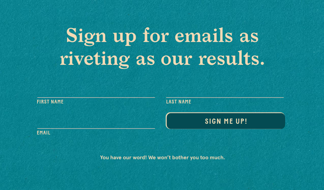
Nº 009 — Data Collection Pop-Up

This sample demonstrates data collection and text hierarchy for an effective call-to-action, designed to engage and convert.
Nº 010 — Business Card (Front)

Featuring an embossed logotype with matte ivory foil stamping, these business cards add a tactile quality to the robust and refined design.

Premium letterpress business card design with embossed, and matte foil Better Fellas logotype.
Nº 011 — Agency vs PPC

This playful chart contrasts the streamlined efficiency of an exclusive pay-per-click agency with the comprehensive services of a traditional all-inclusive agency.

typographic hierarchy comparison infographic, including larish neue, mabry, and baton typefaces for better fellas, pay-per-click agency in Little Rock, Arkansas.
Nº 012 — Website CTA

All website calls to action are direct and concise, leading users to a pricing calculator designed to filter out unqualified prospects.

Nº 013 — Website Footer

The website footer seizes every opportunity to embrace a playful tone, carefully balanced to avoid sounding overly pompous.

typographic hierarchy, including larish neue, baton, and apercu typefaces for better fellas, pay-per-click agency in Little Rock, Arkansas.
Logotype design for Better Fellas, Pay-Per-Click Agency in Little Rock, Arkansas, including address and friendly messaging in type lockup.
Nº 014 — Custom Slider for Simple UX

A custom slider incorporates five JavaScript variables to succinctly convey the nuances of partnering with Better Fellas, while offering a more engaging and effective alternative to traditional pricing tables with dynamic pricing breakpoints.

Javascript, programming, custom web design solution for better fellas, pay-per-click agency in Little Rock, Arkansas.
Nº 015 — Project Proposal Stamp Design

This design features a stylized rendering of the Unbound Collective office, reimagined as the Better Fellas headquarters, acknowledging the origins of our collaborative business efforts.

Office stamp illustration and graphic design for Better Fellas, Pay-Per-Click Agency in Little Rock, Arkansas.

Client........Better Fellas
Photography...Sarah Oden

© 

.........Unbound Collective

To maintain high quality and personalized attention our clients expect, we work with a select number of businesses at a time.

Join Our Waitlist

Work with Unbound and Grow your Business

At Unbound, we dedicate ourselves to delivering unparalleled focus and expertise to each of our partners.

If you're interested in partnering with us to redefine your brand's design, direction, and strategy, we invite you to join our waitlist. By joining, you'll receive regular updates about our projects, insights into our process, and news about opportunities to work together.

Join Our Waitlist
OUR PROCESS
01
Compass
Compass Process Logo Lockup for Unbound

A FRAMEWORK FOR STRATEGIC PLANNING—ALIGNING GOALS AND METHODS FOR BUSINESS GROWTH.

More About Compass
02
curation
Curation Process Logo Lockup for Unbound

A FRAMEWORK FOR STRATEGIC PLANNING—ALIGNING GOALS AND METHODS FOR BUSINESS GROWTH.

More About Curation
03
customization
Customization Process Logo Lockup for Unbound

A FRAMEWORK FOR STRATEGIC PLANNING—ALIGNING GOALS AND METHODS FOR BUSINESS GROWTH.

More About Customization

Selected Work

001
Kvinna Studio
View More

Kvinna Studio provides a bespoke photography experience, and dedicates their practice to developing distinctive printed imagery which recognizes and materializes beauty.

View Full Project
An overview of brand identity design, logo design, stationery, photography, print design, and collateral for Kvinna Studio in Little Rock, Arkansas.
Backward Arrow Icon
Forward Arrow Icon
002
The Ouachitas
View More

The Ouachitas is a coffee roaster and brewery with dual culinary and community ambitions in the Arkansas River Valley.

View Full Project
Branded Coffee Bag Packaging for The Ouachitas in Mena, Arkansas.
Beer Can Package Design and Branding for Dead to Me, Blackberry Shandy at The Ouachitas in Mena, Arkansas.
Branded Coffee Bag Sticker Label Rolls for Packaging Coffee at The Ouachitas in Mena, Arkansas
Beer Can Package Design and Branding for Madd Ox, West Coast IPA at The Ouachitas in Mena, Arkansas.
Graphic Design, restaurant illustration and Americana typography for menus at The Ouachitas in Mena, Arkansas.
Backward Arrow Icon
Forward Arrow Icon
003
MedTrust Health Alliance
View More

MedTrust is a group purchasing organization empowering senior care facilities by ensuring cost-effective procurement and transparent pricing.

View Full Project
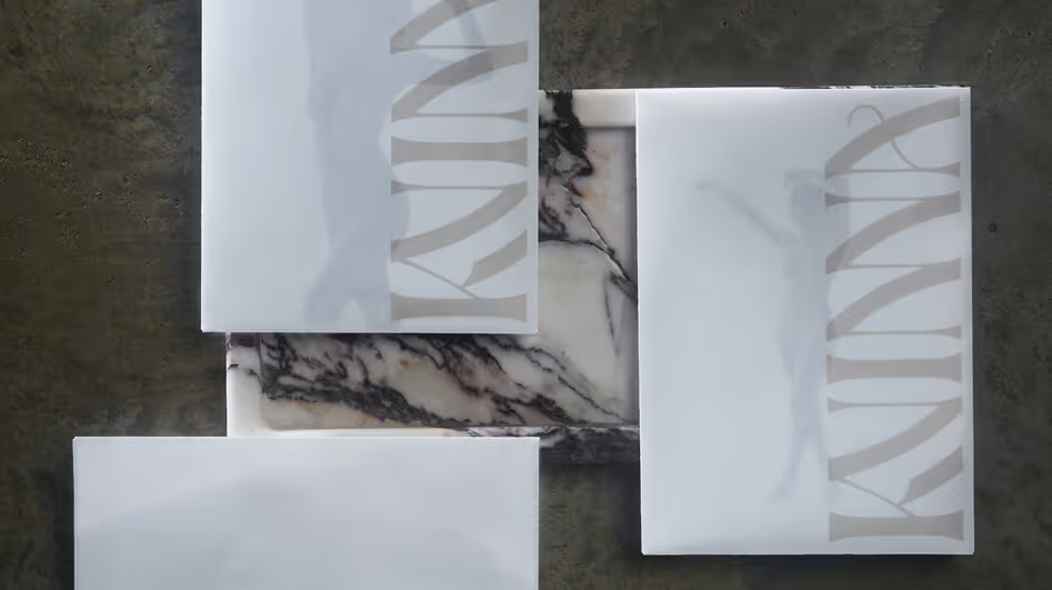
Letterpress-printed, foil-stamped and diecut copies of the Embark Senior Living Summit VIP invites for MedTrust Health Alliance in Fayetteville, Arkansas.
MedTrust Business Card Design Back with Transparency Art Direction.
Overview of all Embark Senior Living Summit by MedTrust, attendee collateral print design, name tags, invitations, and itinerary inside of printed booklet.
MedTrust branded, die-cut sales  pocket folder package design showing semi-open view.
MedTrust art direction, iconography, and slide deck presentation in brand identity motif.
Backward Arrow Icon
Forward Arrow Icon
004
Handle Barbershop
View More

Handle is a bespoke barbershop in downtown Little Rock that was created with a deep respect for the history and craft of barbering.

View Full Project
Victorian-inspired window detail window design install and branding with illustrated raven, for Handle Barbershop in Little Rock, Arkansas.
Interior Design of Handle Barbershop in Little Rock, AR
Backward Arrow Icon
Forward Arrow Icon
005
Fletcher Sparrow Capital Management
View More

Fletcher Sparrow is a hedge fund focused on delivering above-average market returns through their “Floating Castle” fund.

View Full Project
Fletcher Sparrow Capital Management Quarterly Results Print Design Newsletter for Investors.
Fletcher Sparrow Capital Management Hedge Fund, Premium Business Collateral, Business Card and Stationery Design with matte brass foil reflection.
Fletcher Sparrow Capital Management Hedge Fund, Premium Business Collateral, Business Card and Stationery Design.
Backward Arrow Icon
Forward Arrow Icon
006
Better Fellas
View More

Better Fellas is a nimble PPC Agency of two, obsessed with one thing—better Google Ads.

View Full Project
Premium letterpress business card design with embossed, and matte foil Better Fellas logotype, showing badge design stamp
Office stamp illustration and graphic design for Better Fellas, Pay-Per-Click Agency in Little Rock, Arkansas.
Premium letterpress business card design with embossed, and matte foil Better Fellas logotype.
Backward Arrow Icon
Forward Arrow Icon
007
Poco's Beer, Wine, and Spirits
View More

Poco’s Beer, Wine, and Spirits is the first permitted liquor store in Polk County, Arkansas featuring an outlaw cowpoke mascot.

View Full Project
Poco's Beer, Wine, and Spirits Logo and Cowboy Mascot illustration printed on paper sack for liquor store brand identity collateral.
Poco the cowboy mascot. illustration and brand identity for Poco's Beer, Wine, and Spirits in Mena, Arkansas.
Custom, condensed, vintage western slab serif typeface, Poke promotional graphic.
Backward Arrow Icon
Forward Arrow Icon