


logo Design
Creating a Memorable Visual Identity for Your Brand
Logo Design involves crafting a unique and memorable symbol that embodies your brand's identity and values. A well-designed logo serves as the cornerstone of your brand's visual presence, making a strong first impression and fostering recognition among your target audience.
By deeply understanding the essence of your business, we create logos that resonate with customers and stand out in the marketplace. Combining strategic thinking with creative design, we develop logos that are not only visually appealing but also effectively communicate your brand's message and personality.
A strong logo enhances brand recognition, builds trust, and sets the tone for all other visual communications. It is an essential element in establishing a cohesive brand identity across various platforms and touchpoints, contributing significantly to the overall success of your branding efforts.
The Ouachitas Logo
Celebrating Arkansas's sole National Forest, the logotype of The Ouachitas encapsulates the mystique and charm of its natural landscape, honoring the region's unique qualities.


MedTrust Logo
The MedTrust logo features a shield-shaped, ribbon-fold fortress emblem, symbolizing the letter "M". It is paired with a logotype that epitomizes trust and assurance.


Handle Barbershop Logo
The Handle Barbershop logo employs fine rules for shadow-play, crafting a barber’s parlor pole that subtly alludes to the letter "H," honoring the heritage of vintage typography.

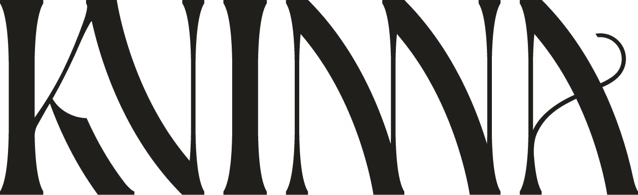
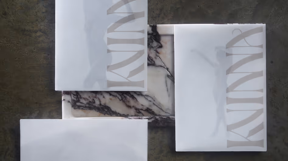
Kvinna Logotype
The Kvinna brand mark was designed to encapsulate the essence of the feminine form. It combines elegance with a luxurious, condensed structure, reflecting curvilinear features.
Better Fellas Logotype
The Better Fellas logotype merges hip, with a carefree spirit—featuring a refined hybrid of geeky mono-space and script typography.

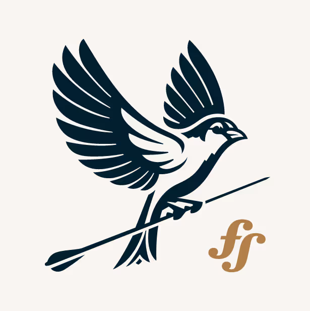
Fletcher Sparrow Logo (A)
The primary brand mark features an elaborate depiction of a sparrow in flight, clutching an upward-pointing arrow to symbolize market growth.
Fletcher Sparrow Logo (B)

Poco's Beer, Wine, and Spirits Logo
The Poco's brand identity is defined by a custom-lettered logotype accompanied by a distinctive mascot, both embodying the playful essence of the brand.

KB Studios Logo
The KB Studios brand mark is a monogram kiss "KB" to represent the initials of the proprietors, while alluding to premium wedding cinematography service.
Camp Taco Logotype
Camp Taco's brand mark is a custom-lettered late 70's-80's campy logotype, embodying the summer camp charm of the small-batch brewery project from the team at Lost Forty Brewing.
Keeper Wars Logo
The Keeper Wars brand crest is designed in four variations, tailored for specific applications. Central to the design is a soccer ball in dynamic motion, visually deflecting to form the letter 'K.' This captures the brand's namesake in a striking and apt athletic visual aesthetic.
Natural State Rock & Republic Logo Badge
Natural State Rock & Republic's concentric typographic logo badge captures the essence of its brand, reflecting the unparalleled experiences it offers to cyclists and outdoor enthusiasts on guided treks through the breathtaking Ozark region of Arkansas.
Yella Dog Honey Logo Lockup
Yella Dog Press Logo Lockup
Yella Dog Press and Yella Dog Honey's concentric typographic and illustrated logo badge is hand-rendered to reflect delta roots and Yellow dog Democrat work ethic. From letterpress to beekeeping, these brand marks use a consistent visual system to unify the respective passions and community ambitions of the owner.
PharmaTrust Logo
PharmaTrust is a co-op of MedTrust, adhering to the same visual ribbon and typographic system to unite the visual aesthetic between each brand.
Ullr Black Logotype
Ullr, the nordic god of recreation inspired this custom logotype for one of The Ouachitas' Dark IPA brews.
Big DIPA Tropical-Style Double IPA Logotype
Inspired by the Big Dipper, this double IPA logotype from The Ouachitas strikes a playful balance, capturing both celestial wonder and tropical vibes.


The Confraternity of The Pelican Christ Logo
Reach Out Your Hands And Be Healed Logo
Inspired by Catholic symbolism, The Confraternity of the Pelican Christ is a an association of faith committed to remembering and sharing God's presence and love, and encouraging others to seek and experience the joy, and healing power of the Eucharist.
Daze One Imperial IPA Logotype
A little hazy, perhaps a daze—this imperial IPA marks the very first creation of The Ouachitas team at the launch of their microbrewery. The logotype captures the spirit of that moment, evoking a sense of metaphorical haze and allure.
Ivy Vacations Logo
The typography-driven logotype for Ivy Vacations blends illustrative elements with design, incorporating foliage-inspired details into the character counters.


Dead To Me Blackberry Shandy Logo
Defiantly delicious, with a sinister side—the Dead To Me Blackberry Shandy features custom-lettered thorn-serif typography inspired by blackberry bushes, intertwined with a striking skull illustration.
Still Well American Lager Logotype
Presented in a monochrome palette against a light background, the custom blackletter logotype for The Still Well embodies a timeless aesthetic, perfectly setting the tone for this serious American lager.

Arkansas Museum of Fine Arts Art Garden Logotype
Art Garden was a community-driven art installation created to celebrate AMFA's Grand Opening on April 22, 2023. Designed in harmony with AMFA's brand guidelines, the project featured a bespoke, floral-inspired script that beautifully captured the spirit of community and creativity behind Art Garden.

Chandler Family Dentistry
A concentric logomark, featuring linear elements that subtly evoke the form of teeth, elegantly transitions into the letter "C," for Chandler. This design seamlessly integrates a harmonious friendly logotype, embodying the values of this Little Rock father-son dentistry duo.

Ava Model Management
With a name inspired by the simplicity of a palindrome, AVA Model Management required a custom-lettered logotype to set itself apart. Based in Little Rock, the modeling and talent agency serves the creative needs of Arkansas and beyond with a distinctive and modern identity.
Customize Your Branding and Marketing
create memorable Customer Experiences that Drive Revenue Growth
A FRAMEWORK FOR STRATEGIC PLANNING—ALIGNING GOALS AND METHODS FOR BUSINESS GROWTH.

A FRAMEWORK FOR STRATEGIC PLANNING—ALIGNING GOALS AND METHODS FOR BUSINESS GROWTH.

A FRAMEWORK FOR STRATEGIC PLANNING—ALIGNING GOALS AND METHODS FOR BUSINESS GROWTH.

Selected Work
Kvinna Studio


The Ouachitas


MedTrust Health Alliance


Handle Barbershop


Fletcher Sparrow Capital Management


Better Fellas


Poco's Beer, Wine, and Spirits


